☰ Table of Contents
- Complete Guide
- Table of Contents
- Introduction
- Welcome to iScreensaver
- Downloading and Installing
- Designing and Preparing
- Preferences
- Managing Projects
- Importing Media
- Editing a Screensaver
- Branding Control Panels
- Customizing Installers
- Building Installers
- Distributing Installers
- QuickStart and Sample Projects
- Installing a Screensaver
- Troubleshoot
Editing a Screensaver Project
Once all the assets are located within the screensaver project, the fun begins.
The Sequence area of the Video tab displays thumbnails of movies, photos, and 3d object files, arranged in playback order from left to right, top to bottom. Switch to List View and all parameters can be in a spreadsheet format. Some columns (text captions) can be edited in place. On the Audio tab, the audio soundtrack sequence is always in List View.
Organizing the Sequence Items
Any item can be rearranged or duplicated within the Sequence. Use the standard selection keyboard short-cuts to choose multiple and non-contiguous assets. If using 'Shuffle' features, assets do not need to be arranged in any particular order.
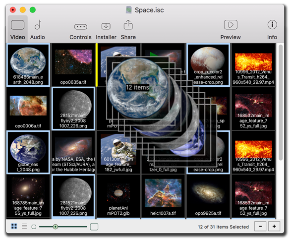
Rearrange sequence order by dragging contigous or non-contiguous asset thumbnails to a different point in the timeline.
To Select Multiple Items:
- In the Video or Audio tabs, you can select multiple items, including non-contiguous sets by doing one of the following:
- Click for single assets.
- Shift-click for contiguous assets.
- Hold down the Shift key and use the arrow keys to move the selection (this will select items as you visit them).
- On Macintosh, command-click for non-contiguous assets.
- On Windows, control-click for non-contiguous assets. - From the Edit Menu, choose one of the following:
- Choose 'Select All' to select all items.
- Choose 'Select None' to select nothing.
- Choose 'Invert Selection' to select the un-selected items.
To reorder items:
- Select the item(s) to move.
- Drag and drop the items to the desired location within the Sequence area.
The items will then move into the new order.
To duplicate items:
- Select the item(s) to duplicate.
- Do one of the following:
- Select Duplicate from the Edit menu.
- On Macintosh, type Command-D.
- On Windows, type Control-D.
- Right-click the item, and from the Edit menu, choose 'Duplicate.'
The item(s) will be duplicated. The duplicated items will be selected and located immediately after the last selected item.
Tips:
- Use these selection and duplication techniques in both Thumbnail View and List View.
- Duplicating, re-ordering, or deleting an item does not affect the asset files on disk.
- In List view, you can only re-order items when sorted by item number.
Previewing the Screensaver
Knowing how your screensaver will look on different computers is one of the hardest parts of screensaver design. Different operating systems (macOS, Windows), CPU speed, RAM, hard drive speed, monitor size and aspect ratio (4:3, HD, 4k, 5, and Wide-screen) can all influence the final result. iScreensaver has features that help you deal with this complexity; however there is no substitute for careful design and testing. Fortunately, the Preview window (also known as the "Stage" Window) can help you as it allows previewing at various sizes.
Access the Preview stage from the toolbar of the Project window. You can have a separate Preview stage for each project that is currently open.
Using the Preview stage
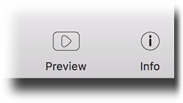
Preview comes with a on-screen heads up display (HUD) for play controls and advanced information, and the stage can be easily resized. On Macintosh, the preview stage has additional size/scale controls so you can simulate various monitor sizes.
The Preview stage with advanced heads up display open.
Heads Up Display
Move cursor over the Preview stage to bring up instant play options, mute audio, skip assets, or unzoom from full screen.
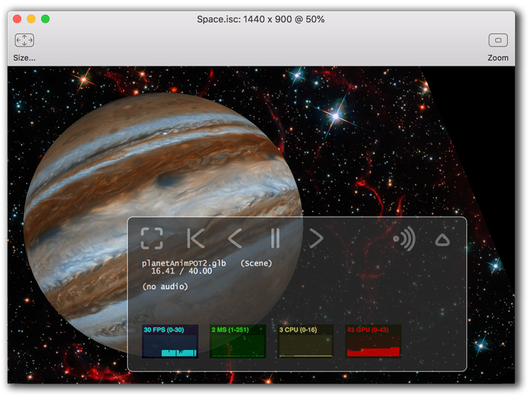
Size
Click to bring up a pop-up menu. Select from many popular monitor resolutions, at 25%, 50%, 100%, 150% and 200% scaling factor. This lets you preview a 30" monitor on a 15" screen.
Zoom
Switches the Preview to full screen. For multi-monitor systems, just move the Preview stage to the monitor you wish to use, then click zoom to go fullscreen on this monitor. [Also available via the HUD's Zoom button]
Playing the preview
There are two ways to play the preview, either from the current sequence location or from the beginning of the sequence. Using the HUD or pressing the space bar will start at the current location, but use 'Run Full Screen' from the Preview menu to restart the sequence. The arrow keyboard controls can quickly jump between assets.
Resizing the stage
Why is guessing the user's monitor sizing and resolution so difficult? Well, assets can be set up to run at actual size, proportionally stretched, full screen, or even with custom sizes, and users' monitors have different ratios of pixels and widths. What lines up with one machine might line up totally different on another.
The trick is to test a variety of different sizes, and settings, and find what feels most comfortable to your screensaver design layout.
Use the pull-down menu to choose from different popular monitor resolutions. If you have limited screen space, try a smaller percentage using the same proportions, which will resize the assets to match. Drag the lower right corner of the Preview stage to change instantly to any custom size.
The Preview stage has additional presets for previewing at popular monitor sizes.
Using the Playback controls
The HUD - the heads up display - appears when the cursor is moved over the Preview stage. In windowed' mode, the HUD auto-hides when the cursor leaves the window. In full-screen mode it auto-hides after 5 seconds (leave your mouse cursor in the HUD to prevent auto-hide). The HUD buttons are as follows:
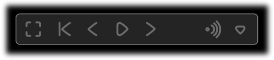
The heads up display.
Rewind
Returns to the beginning of the sequence order. Play resumes if the sequence was playing.
Back Skip
Skips backward through the sequence order to the previous item.
Play | Pause
Pauses or resumes playback.
Forward Skip
Skips forward through the sequence order to the start of the next item.
Audio Mute
Switches audio on and off.
Disclosure Triangle
Click to view detailed play status information (video and audio file names, play time, other debug menus).
Zoom | Unzoom
Switches full screen on and off.
Viewing advanced playback information
With the HUD expanded, more details about playback status are available. This includes asset filenames (for main video and audio sequence items), frame rate, play time and total duration, CPU and GPU load percentages, and playback status. Use the disclosure triangle to toggle views.
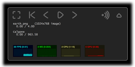
The advanced heads up display.
Tip:
- Making edit changes with the Preview stage window open will update in real time. This can be slow, depending on your computer speed and the size and number of item(s) selected. For faster performance, consider making edit changes with the Preview stage window closed.
- The HUD can only be expanded in Authoring mode. This feature is not available in installed screensavers.
Setting and Changing Options
Use the Info Palette to view and change sequence and item settings and properties. The Info palette can be accessed by the toolbar in the Project window. You may change settings for a single Sequence Item, or multiple selected Sequence Items.
The Info palette
Sizing, locations, captions, overlays, duration, and compression are but a few of the options available through the Info palette. From a macro level to micro, the left to right order of toolbar icons scales from global settings to item settings.
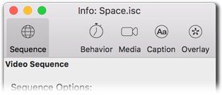
The setting categories of the Info palette.
Global
Settings which affect the entire sequence as a whole, such as Loop and Shuffle. For both Video and Audio sequences.
Behavior
Options specific to each Sequence Item, such as duration, disabling text caption and overlays, and interactivity.
Media
Settings for individual assets, such as size, location, background color or masking, movie audio volume, visual effect transitions, and image compression and sizing.
Caption
Settings for the Text Caption Overlay layer, providing styled unicode text with foreground and background color and transparency. [Video sequences only]
Overlay
Settings for the Overlay Picture layer, providing still images that overlay the other layers. [Video sequences only]
To navigate the Info palette:
- Change the selected tab on the Info palette by clicking the toolbar icon.
- From the Item Menu, choose 'Global,' 'Behavior,' 'Media,' 'Caption,' or 'Overlay.'
- Right click an item in the Sequence editor, and choose one of the following:
- Choose 'Global' to select the Global tab.
- Choose 'Behavior' to select the Behavior tab.
- Choose 'Media' to select the Media tab.
- Choose 'Caption' to select the Caption tab.
- Choose 'Overlay' to select the Overlay tab.
- Use keyboard shortcuts 1 thru 5.
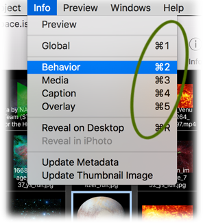
When editing, use keyboard shortcuts to quickly switch between settings.
Global settings
Governs the order of item playback, and behavior when exiting or resuming the screensaver. A sequence can use a random, or shuffled, order, it can remember where it left off and resume playback at that item and play time, or use the first item in the sequence always upon startup.
Note that these settings apply to Video and Audio sequences independently.
Global settings can be different for video and audio sequences.
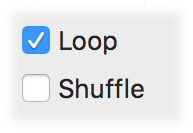
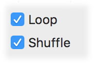
Loop
If Loop is checked, after completing one entire sequence, the sequence will begin again, repeating forever (or until the user exits the screensaver, or the computer's power manager puts the screen or computer to sleep).
Note that this setting applies to the sequence as a whole, and can be applied to the Video and Audio sequences separately. So one could, for example, have a video sequence that loops, and an audio sequence that does not loop. If you are using audio, we recommend this setting, since audio that loops forever can limit end-user screensaver usage.
Shuffle
Items will be played back in a shuffled order. (Note: 'shuffle' means that each item will play back once with no repeats for a given sequence. Just like shuffling a deck of cards, you can never see the same card twice in a single deck.) When does the re-shuffle happen? Read on...
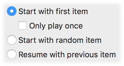
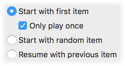
Start with First Item
Always starts the screensaver with the first item in the sequence. This is often used to have an 'opening title' or 'opening song' before resuming with the rest of the shuffled sequences.
Only Play Once
Plays the first item only once, allowing loop cycles without repeating the first item in the video sequence, even if 'Shuffle' is turned on.
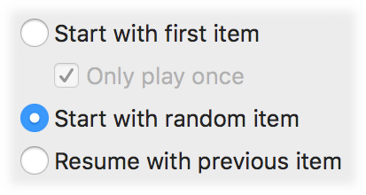
Start with Random Item
Begins at a random location within the sequence. Then, the rest of the items are played in order, unless, of course, 'Shuffle' is turned on.
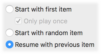
Resume with Previous Item
Every time the screensaver plays, it remembers the item playing when it was exited. The next time the screensaver starts, it resumes where it had stopped. For Video or Audio items, it will resume with the same item AND the same time offset as it stopped at. For example, if a movie was playing and it stopped at 2 minutes 32 seconds, it would resume at the same position. 3d animations and Image items always resume at the beginning of their play time.
When combined with Shuffle, this will cause the entire shuffled sequence pattern to play until completed before reshuffling. This setting is often used with hundred- or thousand-item slide shows, so you see the entire sequence before it repeats.
Sequence Order Logic
When looping and shuffling are used together, the combinations of options change the order of the sequence pattern in a variety of possibly bewildering ways. Both Video and Audio Sequences have the same logic structure for these settings, though each sequence can have its own settings.
Let's use the example that you have a sequence with a total of five items:


There are four combinations possible with loop and shuffle, and four settings for how the sequence starts up. Thus, sixteen different styles of playback behavior.
For this example, we illustrate three different 'sleep cycles': In the first activation, we exit the screensaver at the end of the third sequence item; the second activation, we exit the screensaver at the end of the fourth item; and for the final activation the screensaver is allowed to play indefinitely:
|
|
|
|
|
Start with first item: | ||||
|
first: 1 2 3 
second: 1 2 3 4
third: 1 2 3 4 5 [blank]
|
first: 1 3 4
second: 1 5 3 2
third: 1 5 2 3 4 [blank]
|
first: 1 2 3
second: 1 2 3 4
third: 1 2 3 4 5 1 2 3 4 5 1 2 . . .
. . .
|
first: 1 4 2
second: 1 3 4 5
third: 1 5 2 3 4 1 2 5 4 3 1 3 . . .
. . .
|
Start with first item but only play first item once: | ||||
|
first: 1 2 3
second: 1 2 3 4
third: 1 2 3 4 5 [blank]
|
first: 1 3 4
second: 1 5 3 2
third: 1 5 2 3 4 [blank]
|
first: 1 2 3
second: 1 2 3 4
third: 1 2 3 4 5 2 3 4 5 2 3 . . .
. . .
|
first: 1 4 2
second: 1 3 4 5
third: 1 5 2 3 4 2 5 4 3 5 3 . . .
. . .
|
Start with random item: | ||||
|
first: 4 5 [blank]
second: 1 2 3 4
third: 3 4 5 [blank]
|
first: 5 3 4
second: 2 1 5 4
third: 3 2 5 1 4 [blank]
|
first: 5 1 2
second: 4 5 1 2
third: 3 4 5 1 2 3 4 5 1 2 3 4 . . .
. . .
|
first: 3 4 2
second: 1 3 2 4
third: 5 1 2 3 4 1 2 5 4 3 2 3 . . .
. . .
|
Resume with previous item: | ||||
|
first: 1 2 3
second: 3 4 5 [blank]
third: 1 2 3 4 5 [blank]
|
first: 4 1 3
second: 3 2 5 [blank]
third: 5 3 1 2 4 [blank]
|
first: 1 2 3
second: 3 4 5 1
third: 1 2 3 4 5 1 2 3 4 5 1 2 . . .
. . .
|
first: 4 1 3
second: 3 2 5 1
third: 1 5 4 2 3 4 3 5 1 2 4 1 . . .
. . .
|
Tips:
- Non-looping video sequences leave the screen blanked after the sequence completes. However, if you are trying to save energy, it's better to use the computer's Energy Saver settings. See our Green Screens campaign for more information.
- Audio soundtracks that loop can get annoying, and can be more effective as a screensaver if they turn off after only one cycle. In other words, we recommend that you do not set the Audio sequence to Loop.
- If you only have a single item in the sequence, set the item to cycle forever within the Behavior:Play tab. This is especially important for movie files, where there can be a half-second pause each time the sequence loops. If the loop is in the Item (rather than the Sequence) then the looping will often be seamless.
- A single item set to play forever, in the middle of a larger Sequence, will cause the screensaver to get "stuck" on that single item. Test your entire sequence before distribution.
- Shuffle will re-randomize each time the screensaver activates or when it loops at the sequence end, with an exception if Resume is selected, and then it will re-shuffle only at that sequence's end.
- 'Start with first item' could be a title card, bumper video, or a splash screen, or an opening orchestral overture or sound effect, as this option forces the first item to always begin the sequence, no matter whether it is shuffled or not. When the sequence repeats, the first item will again play at the top of the sequence, unless "Only play once" is selected.
Behavior settings
The Behavior tab is used to set properties that apply to an item as whole (such as playback duration), and to switch off the different layers - Caption and Overlay. Changes made here will affect any selected item(s) in the Sequence window.
Play Behavior sets image durations, movie looping, and in/out points.
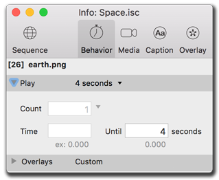
Specifying item duration
Use preset pop-up menu to quickly set the time or play count for an asset. The options available depend on the type of the selected item(s). For example, for a single movie, you could set a custom in-point and out-point and loop count, without needing to duplicate or trim the actual file.
To choose a preset duration:
- Select the item(s) to modify.
- In the Info palette's Behavior tab, choose how long they should be displayed, in seconds or, in the case of movies, number of repeating times.
The assets will then play for that preset duration.
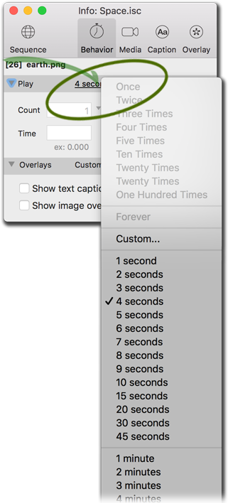
The Duration pop-up menu.
To set a custom duration:
- Select the item(s) to modify.
- Open the custom settings in the Info palette's Behavior tab, by choosing the 'Custom...' option at the bottom of the pop-up list.
- Either do one of the following:
- Choose number of times to repeat a movie.
- Choose a new start and end time in seconds, for either movies or images.
The assets will then play for that custom duration.
Tips:
- For Movies: Start Time, End Time, and Play Count may be set.
- For Images: only End time is editable.
- Setting an End Time later than the actual file duration will cause unpredictable behavior.
- One movie could be duplicated many times with differing start and end points, but the build will save space by only including the movie a single time.
Enabling overlays
Controls for switching the text and image overlays on or off. Both default as 'Disabled'. The Text caption defaults to showing the filename on a background plate, while the Image Overlay defaults as an empty image.
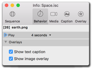
If overlays are not appearing, make sure they've been switched on at their master control.
Show Text Caption
When checked will show any text captions from the Caption tab.
Show Image Overlay
When checked will show any image overlays from the Overlay tab.
Media settings
Control specific details about the main video or audio assets within each Sequence Item. The subsections include audio controls, background colors, sizes, locations, transition video effects, and image resizing and re-compression settings.
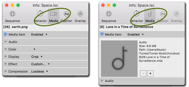
Many Media subsections for video assets; less Media settings for audio assets.
Choosing the Media Item
The Media Item subsection shows the asset Thumbnail and file path. It is possible to replace or delete the Media asset from the item, without removing the item itself from the sequence. This can leave a 'media-less' item which may (or may not) be useful.
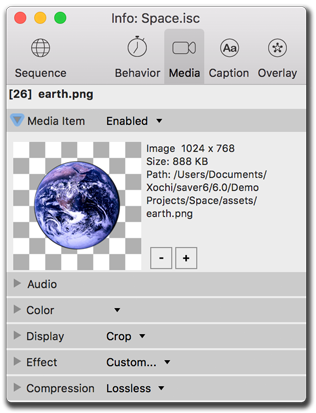
Some technical information can be found about the Media Item.
Selecting a different Media file
There are times in production where only the media file itself needs to be changed, while the other item settings are fine. You can change only the media file, leaving the rest of the Sequence Item untouched.
To replace a media item:
- Select the item(s) to edit in the Sequence editor.
- In the Info palette's Media tab, open the Media Item subsection by clicking the small triangle (if needed).
- Click the '+' button to replace the media file for the selected item(s).
- From the File Browser, select a media file to replace the previous one(s).
This selected file will both replace the content and reset many default options of any selected Sequence Items.
Deleting a Media file
There are times in production where an element needs to be removed and replaced immediately, but it might be unclear just what the replacement shall be. Thus it is possible to delete just the Media Item, leaving Captions and Overlays untouched, yet testable and waiting for the new content.
To delete a media item:
- Select the item(s) to edit in the Sequence editor.
- In the Info palette's Media tab, open the Media Item subsection.
- Choose the '-' button to delete those media items.
This action will remove the media content only from the selected Sequence Items.
Tips:
- Replacing or Deleting the media from an item does not affect the asset file(s) on disk.
- If multiple items are selected, Replacing or Deleting the media item applies the same one media file to all selected items. For example, you can replace the media of 50 selected items with one new file. You can not, however, replace the media of 50 selected items with 50 different files.
- Remember that the [+] button on the Info palette does not add a new media item. To add an entirely new media item, use the [+] button on the Project Sequence window instead.
Using Items with Audio
Movies files can have internal audio tracks and sound effects. On the Media tab's Audio subsection, control how these foreground sounds mix with the Audio tab's background playback. Choices include a default of playing both tracks with no change in audio mix levels, or the ability for changing, pausing, or muting the background track.
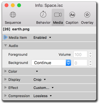
Audio Sequence background audio levels can be adjusted against the selected foreground Item(s) volume.
Volume controls
This media item's foreground audio uses a volume control that ranges from a Mute position at 0 (zero) to the default position of a loud 100. This only functions with movies.
Background audio controls
Background audio includes any audio track playing from the Audio sequence playlist. Options include lowering the volume while continuing play (called "ducking"), muting the volume while continuing play, and pausing the background track until the media item has completed.
Tip:
- Muting the background audio functions exactly the same as Continuing to play the track at a volume of zero.
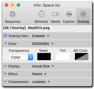
Masking with Colors and Transparencies
Images can be framed or punched out and placed on a background color, have a color tint added, can filter out a specific RGB color (or range), or use the alpha channel masks that some file types (PNG, TIFF, GIF) provide.
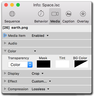
Different color options.
Setting Transparent colors
iScreensaver will use the Transparency setting's Color as a masking filter to punch out as much of that value from the image as possible.
To select an RGB color as a mask in an Image:
- Select the item(s) to edit in the Sequence editor.
- In the Info palette's Media tab, open the Color subsection.
- From the Transparency pop-up menu, choose Color.
- Click on the Mask color square to open the Color palette.
- On the Color palette,
- select the eyedropper and use it anywhere on screen.
- Enter the Hue Saturation Lightness values (0-359, 0-100, 0-100) of the color you wish to use as a mask.
- Enter the RGB values (0-255, 0-255, 0-255) of the color you wish to use as a mask.
- Your selected color should 'drop-out' of the image, showing the Background color. Use the Tolerance slider to select more color around your selected color. Reselect a color if not correct.
Any changes you make here do not affect the original media file on disk, so feel free to experiment!
Tips:
- Color masking works best on a solid flat color, such as black or white.
- Using JPEG re-compression on an RGB Color Masked images will almost never work properly. The reason is that JPEG compression subtly alters the final RGB values, so they no longer match the target color. For this reason, when using color masks, don't re-compress the images using JPEG compression. Use no compression or PNG compression instead.
Using Alpha masks
An alpha mask is an layer in an image file that defines the transparency percent when compositing the image with other images. Formats that support such are PNG-24, PICT, GIF, Targa, and are usually created and saved from Adobe Photoshop or the open source GIMP image manipulation software. Most (but not all) images with alpha channels will be automatically detected and mask settings will be auto-set, so you generally won't need to use the following instructions:
To mask a color from an image's alpha channel:
- Select the item(s) to edit in the Sequence editor.
- In the Info palette's Media tab, open the Color subsection.
- From the Transparency pop-up menu, choose Mask.
- If the file has an alpha mask, then that region should 'drop-out' of the image, showing the Background color.
Any changes you make here do not affect the original media file on disk, so feel free to experiment!
Adjusting Foreground Tint
The media item's color spectrum can be tinted by setting the Foreground color with the Color palette. This only works on Images. Note that in addition to changing the RGB color values, you can also change the Alpha percent. Alpha values less than 255 will cause the image to blend in with the background.
Adjusting Background Color
The media item's background color can be changed using the Foreground color with the Color palette. When assets are letterboxed or masked, it is this background color that determines what is extended to the edges of the screen. For Image assets, you can also change the Alpha value of the background color. Combined with the various Transparency settings, this can give you various interesting effects: for example, using a PNG with mask, you could make the background opaque and the foreground transparent, or vice versa.
Tips:
- It's possible to end up with a color setting that makes no sense. To return to the default values, set Transparency to "mask", set Tint to pure white and full opacity (RGBA 255,255,255,255), and set BG Color to pure black and zero opacity (RGBA 0,0,0,0).
Adjusting Media Size and Location
Visual Media Items (Movies, 3d Objects, and Images) can be placed anywhere on the screen in two dimensions, and can be sized using several size modes. This is a tricky part of good design, because many computers have different screen sizes: pixel width, pixel height, and aspect ratios. See Designing & Preparing for more info.
Some items can be adjusted (flipped or rotated) as well.
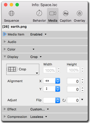
Display modes include size and location settings.
Using the Stretch mode
Every computer monitor is different, and as an author you need to try to design for these variables. The Stretch mode settings give you various options.
Actual Size
The media item will be displayed at it's 'actual' pixel size. For example, a 640x480 QuickTime movie would be displayed at 640x480 pixels in size. No more, no less.
Letterbox
Proportionally scales the asset to keep it contained fully on-screen, using the background color to fill empty space. Technically, the longest dimension of the asset is stretched to match the longest dimension of the screen.
Crop
Proportional scales the asset to fill the screen, whether or not it all stays visible. Technically, the shortest dimension of the asset is stretched to match the shortest dimension of the screen.
Full Screen
Disproportionally stretches the image to fit the screen completely, regardless of asset dimensions. Squares may turn into rectangles, and Circles into Ovals.
Custom X and Y
Set the width and height of the asset to display on-screen as desired, in absolute pixels or percentage of the monitor size.
Visualizing the Stretch mode options:
Let's use the example of three images, one an average squared photo, and one each of wide and tall. Looking at actual size, letterbox, crop, and fill screen, as seen in a conventional 4:3 ratio monitor, a wide-screen laptop, and a high-definition 30" monitor. For comparison, we have added an actual-size overlay picture to the bottom right corner.
Compare the relative sizing of these images


 with these monitor setups:
|
Actual Size |
Letterbox |
Crop |
Fill |
|
|

|
|
|
4:3 Screen |

|
|

|
|
Wide Screen |
|

|
|
|
High Definition |
|
Actual Size |
Letterbox |
Crop |
Fill |
|
|
|
|
|
4:3 Screen |
|
|
|
|
Wide Screen |

|
|
|
|
High Definition |
|
Actual Size |
Letterbox |
Crop |
Fill |
|
|
|
|
|
4:3 Screen |
|
|
|
|
Wide Screen |
|
|
|

|
High Definition |
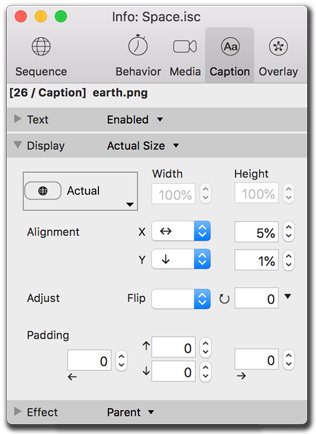
Using the Alignment controls
The Media Item will be positioned on the screen according to the settings of the Alignment controls. Using X (width) and Y (height), the asset can be positioned to a particular spot, or to a proportional location. It is worth testing many screen sizes with the Preview stage when using these settings.
X / Width
Defaults to the center of the end user's monitor. Can be aligned to either the left or right sides of the screen, with optional pixel or % offsets.
Y / Height
Defaults to the center of the end user's monitor. Can be aligned to either the top or bottom sides of the screen, with optional pixel or % offsets.
Values
Offset numbers can be expressed in positive or negative pixel amounts, or by percentage of the end user's monitor setup. Use the '%' symbol after the number to differentiate percentages from pixels.
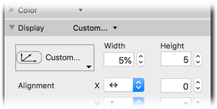
The width set to 5% (percent) of the screen size, height set to 5 pixels.
Adjusting Flip and Rotation
It is simple to flip or rotate the Media Item, in cases of incorrect importation. This only works with Image files, and does not change anything with the original file.
Flip
Image Assets can be flipped horizontally, vertically, or both directions at once.
Rotate
Image Assets can be rotated to any angle. There are some presets for rotating clockwise or counter-clockwise 90-degrees, as well as a 180-degree flip.
Tips:
- The Stretch Mode and Alignment settings generally follow HTML5 rules: a raw number (such as 123) is interpreted as a pixel value, whereas a number with a % sign (such as 45%) is interpreted as a percent of the screen width.
- Negative percentages are possible, listed like "-50%".
- Screen width is determined at the time of playback on the user's computer. So 50% of the author's screen width will probably not be the same as 50% of the end-users's screen width.
- Not all settings can be applied to all media types.
- Image locations for the foreground Media item are also affected by the motion effect, as described in the Transition effects section.
Setting the Visual Effect Transition
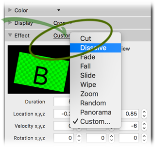
Each media item will appear onscreen. How does it appear? Movies and 3d object files appear onscreen immediately, using a Cut effect. Images default with an one-second Dissolve with some slight motion. But there are some other options to test and explore.
Custom options available for effects motion.
Effect Types
There are many simple effects, and some very powerful custom motion controls. You might need to play with the custom values to fine-tune your presentations.
Cut
An immediate switch from the previous asset.
Dissolve
A slow fade between the previous asset and the new asset. Both assets are visible on screen at once.
Fade
The previous asset fades to its background color which dissolves to the new asset's background color then fades up the asset. Use the default background color of black for fading to black between assets. In a Fade effect, the first item is completely gone before the second item begins to appear.
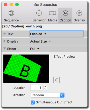
Fall
The new asset drops downward at an angle, covering the previous asset. There are four directional presets plus random.
Slide
The new asset slides across, up, or down, covering the previous asset. There are four directional presets plus random.
Wipe
The new asset wipes across, up, or down, covering the previous asset. There are four directional presets plus random.
Zoom
The new asset zooms from the center, covering the previous asset. Adjustments can be made to all initial 3-D coordinates (X, Y, and Z).
Panorama
The new asset dissolves up, covering the previous asset. Default is a scroll set for 40 second duration at -3 Y rotation, from left to right.
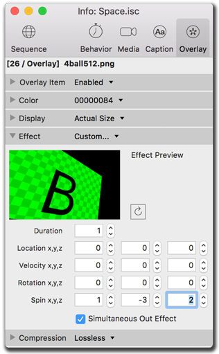
Custom...
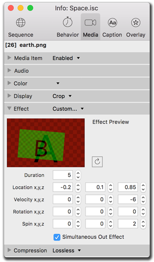
The fun begins! Create your own effect, by setting initial location, initial velocity, initial rotation, and spin speed. These are all 3-D coordinates (X, Y, and Z) so some really interesting effects are possible.
To use a preset effect:
- Select the item(s) to edit in the Sequence editor.
- In the Info palette's Media tab, click the Preset effect listed on the Effect subsection.
- Choose an effect from the pop-up menu.
- Open the Effect subsection to change specific effect settings.
Your selected effect will preview a generic A / B animated example.
The Effects pop-up menu.
Setting Effect Duration
Every effect, except Cut, has a duration setting. This is not to be confused with the Media Behavior Duration. The Effect duration is independent, and controls the duration of the effect motion and (with many effects) the alpha dissolve.
Setting Random Motion
Some effects provide a 'Random Motion' checkbox that, when checked, will provide a pleasing gentle in/out/left/right motion while the image is onscreen.
Using Custom Effects
The types of movement include location, velocity, rotation, and spin. Location and Rotation set up the asset, while Velocity and Spin determine speed and direction of motion. The Simultaneous Out Effect changes the timing of the A-item's Out point.
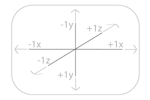
Standard HTML coordinates are used, where the screen is always 2.0 units wide, with the height depending upon monitor aspect ratio. The center of the screen is the zero (0, 0, 0) point, with positive XYZ towards the right, down, away from camera. Positive rotations are clockwise. Inital rotation is measured in degrees. Velocity is measured in screen units per second divided by 100. Spin is measured in degrees per second. Z coordinates of less than -1.0 are 'behind the camera' and thus invisible.
You can do all sorts of weird things with custom motion effects, and there are many ways to get images offscreen or invisible. Caveat emptor. Remember the Undo!
Location
Set the starting location for the asset from a centered 0,0,0 point, usually ranging from -1 (left, raise, closer) to +1 (right, lower, further), using numbers as small as in tenths and hundredths.
Velocity
Set a speed and motion direction along an axis, in units per second divided by 100, using positive and negative numbers as small as in tenths and hundredths.
Rotation
Set the starting rotation position for the asset, usually ranging from -180 to +180 degrees.
Spin
Set a speed and motion direction of rotation around an axis, in degrees per second, using positive and negative numbers as small as in tenths and hundredths.
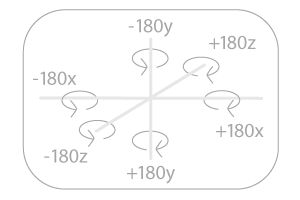
Initial location centered at 0,0,0. Rotation in degrees around independent axes.
To use a custom effect:
- In the Video tab, select a file.
- In the Info palette's Media tab, open the Effect subsection.
- Choose Custom... on the pop-up menu.
- Change X Y Z values to affect the B motion in the preview.
- Click the Recycle button to repeat the preview.
Your selected effect will preview an A / B example.
Tips:
- Video effects depend on hardware acceleration. Please see System Requirements for more info.
- It's easy to overpower even the fastest computers using these effects. A combination of a large image size, short effect duration, and lots of effect movement can cause performance problems. In addition, performance may vary more than 10 to 100-fold between old and new machines. Do not assume an effect that works great on your computer will work on anyone else's. For best results, always test on old, slow computers.
- If slower machines are being targeted, consider making these changes: Reduce image sizes, use Cut effects only, and increase the item duration (on the behavior tab). The more you can slow down the presentation, the better chance older computers wil have of rendering it.
- To see many the effect settings for many assets at once, switch the Video tab to List View and enable the various 'Fx' columns.
- If the Info palette is open to Effects, and the preview stage is playing, then each change made to an Effect field will restart the item in Preview, even with shuffle turned on. Use tab and shift-tab to set the parameters and restart the motion effect.
Previewing Transitions
Use the A / B thumbnail previewer by opening the Effect subsection. The 'B' frame represents any selected sequence items in the screensaver. Replay the thumbnail preview with the Recycle button.
Working with Compression Presets
Image files (PICT, JPEG, PNG, etc.) can be resized and/or re-compressed when used in iScreensaver. This has several advantages: You can import high-resolution images directly from your camera without re-sizing first. Images can be easily resized using presets in case you wish to build more than one version (for example, a "high resolution" and "low resolution" version. Please read about image size limitations and using Best Practices.
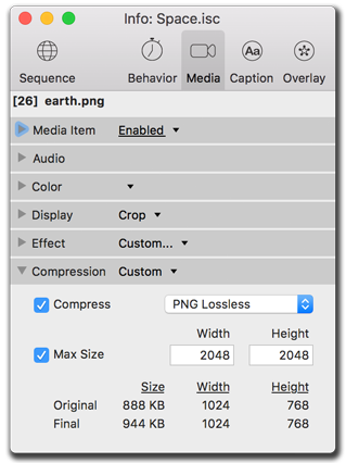
Image compression settings.
Presets
The compression/size presets menu has a few settings that will often work for most situations. Use the Custom setting for manual control of the parameters.
- 4k Quality (4096 x 4096) : For 360* Spherical images mainly.
- Very High Quality (4096 x 2048) : Normal horizontal wide panoramic photography.
- Very High (Tall) (2048 x 4096) : Vertical panoramic photography.
- High Quality (2048x2048) : Normal photography, default setting for most images.
- Medium Quality (1024 x 1024) : Older photography, or used for lower resolution machines.
- Low Quality (512 x 512) : Low resoution source material.
Compress
Choose a compression level.
- PNG : a "Perfect" or "Lossless" compressor that also preserves the alpha-channel (transparency) and does not introduce any noise into the image. If it's perfect, why not use it always? There's a catch: PNG does not compress very highly, so the final Image byte size is often very large.
- JPEG: a "lossy" compressor, JPEG does not support alpha channels (transparency), but is a much more efficient compressor than PNG, often compressing images 2, 5, 10, or even 50 times smaller than PNG. JPEG 8 is the best quality (but largest file size) and JPEG 0 is the worst quality (but smaller file size).
Maximum Size
It's very important to limit images to a size that is appropriate for the end user's monitor size and computer speed. Using this setting, images that are larger than the width or height provided will be proportionally resized. Images smaller than the width & height will not be resized. Please read about image size limitations and using Best Practices.
Original & Final Image Size
When using resizing or compression, if a single item is selected, its image size (pixels and bytes) will be shown. Note: this may take a few seconds to update with large images.
Tips:
- Please read about image size limitations and using Best Practices.
- Compression and resize settings never affect your original files on disk. Feel free to experiment.
- Images usually look better when keeping a high maximum size while reducing the compression factor. An image saved at 1600x1200 Low compression looks better than if saved at 800x600 High compression, even on smaller monitor systems.
- When using the "Actual Size" Display / Stretch mode settings, the actual size used will be the size after resizing and compression.
- There is a maximum image size of 4096 pixels in width and height. Any images larger than this will be automatically resized down. Warnings that this is happening will be seen in the Build logs.
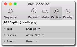
Caption overlay settings
Every Sequence Item can have a text caption, using international unicode fonts and styles. In addition, special "insert variables" can insert the asset filename, asset size, and meta data from iTunes (such as Title or Description). Text captions can have an overall background color and transparency, and a per-letter foreground text color. During the screensaver build process, text captions are converted to a compressed image file. This means the author doesn't need to worry about font issues on the end-user machine. Text captions are truly WYSIWYG.
The Caption subsections.
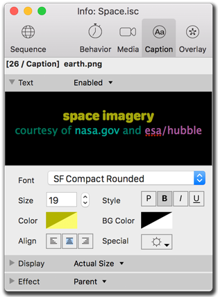
Setting the Caption font controls
Each letter can have its own individual font, size, style, and foreground color. The background color applies to the text block as a whole.
The text options, including fonts, sizes, colors, and special variables pulled from image metadata.
Setting Fonts
Either select the desired font and, then begin typing in the text box. Or, select some letters firat, then choose a new font from the popup menu.
Setting Font sizes
Either select the desired font size and begin typing, or select text first, then change the font size. You can use the up/down arrows to change font size, or type a pixel size directly.
Setting Font styles
Either select the desired font style and begin typing, or type then select the text and choose the font style (P: plain, B:bold, I:italic, U:underline).
Setting Font colors
Either select the desired font color and begin typing, or type then select the text and choose the font color. The foreground text color can be set on a per-letter basis. The background text color affects the entire text caption as a whole.
Setting Text Alignment
Text can be centered or aligned to the left or right sides of the text block.
Inserting Variables
Choose variables from the Special list. These are special text strings that will be converted into a value when displayed. For example, %title% will show the meta-data title field when an image was imported from Photos. To see the resulting value, view the item in the Preview Stage window. You can apply style changes to the %variables%, as long as the %variable% word is all a single style.
Tips:
- Any changes to the variables within iScreensaver will not affect the original file metadata.
- %variables% can have style & color formatting, as long as the word (including % sign on either end) is a single style/color/size.
- Text does not line-wrap. If you need to have a line break in the text, please sure you enter it manually in the text itself. This applies to data from %description% or %title% variables as well.
Adjusting Caption Size and Location
The text captions layer can be positioned in the same way as media and overlay layers. Text can be rotated, flipped, or forced to proportionally stretch to the end users' monitors. Text often looks pixellated and blurry when stretched to large sizes, so Actual Size is often the best display mode to use.
Different settings for screen sizing and location, rotation, and padding for background color plates.
Using the Stretch mode
For captions, usually it is recommended to leave them at their actual size.
Actual Size
A 12 pixel font will be displayed at 12 pixels in size, no matter the final monitor screen size. This is the recommended setting.
Letterbox
Proportionally scales the entire text caption block caption to keep it contained fully on-screen, using the background color to fill empty space. Generally looks terrible unless you are using a very large font size.
Crop
Proportional scales the caption to fill the screen, whether or not it all stays visible. Generally not recommended.
Full Screen
Disproportionally stretches the caption to fit the screen completely, regardless of asset dimensions. Generally looks poor, unless using a very large font size.
Custom X and Y
Set the width and height of the caption to display on-screen as desired, in absolute pixels or percentage of the screen size.
Using the Alignment controls
The captions can be repositioned on the screen using the Alignment controls. Using X (width) and Y (height), the captions can be positioned to a particular spot, or to a proportional location (expressed as a % of the screen size). It is worth testing many screen sizes with the Preview stage when using these settings to get a feel for how items will be located on various monitor sizes.
X / Width
Defaults to the center of the end user's monitor. Can be aligned to either the left or right sides of the screen, with optional pixel or percent offsets.
Y / Height
Defaults to the center of the end user's monitor. Can be aligned to either the top or bottom sides of the screen, with optional pixel or percent offsets.
Values
Offset numbers can be expressed in positive or negative pixel amounts, or by percentage of the end user's monitor setup. Use the '%' symbol after the number to differentiate percentages from pixels.
The width set to 5% (percent) of the screen size, height set to 5 pixels.
Adjusting Flip and Rotation
Captions can be flipped or rotated. They will remain in their block size position.
Flip
Captions can be flipped horizontally, vertically, or both directions at once.
Rotate
Captions can be rotated to any angle. There are some presets for rotating clockwise or counter-clockwise 90-degrees, as well as a 180-degree flip.
Adjusting the Padding controls
Add postive or negative numbers to pad extra pixels to the edges of the captions. This helps push the background color away from the text. Padding can be expressed as a percent (of the screen width or height).
Tips:
- Actual Size is usually the best stretch mode for text.
- When using other stretch modes, consider rendering the text at a large font size, and then stretching it down to fit. For example, rendering text at a font size of 200, and then using a Custom size mode of 25% and 25% width and height will give high quality text on a wide variety of monitor sizes (the only downside is a small increase in file size).
- Padding can be expressed as a % of screen width. A nice effect is to use a %padding value with a corresponding left or right alignment.
- The Caption overlay layer is the front-most layer. It will always be in front of the Media layer and the Overlay layer.
Setting the Visual Effect Transition
Each caption has a transition effect available for how it is displayed. The default is a one second dissolve.
Caption effect settings.
Types of Transitions
Most all effects are available, as Captions can have a variety of XYZ motion.
Default
Matches the timing of the Media Item's effect transition.
Cut
An immediate switch from the previous asset.
Dissolve
A slow fade between the previous caption and the new caption.
Custom...
Use various XYZ location and motion velocities to manipulate the caption block in any direction.
Setting Durations
Every effect, except cut, has a duration length setting.
Previewing Transitions
Use the A / B thumbnail previewer by opening the Effect subsection. Replay the preview with the Recycle button.
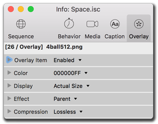
Overlay settings
Need to add an image to every visual asset in your screensaver, but don't want to have to do the compositing work? Luckily, almost any still image can be used as an instant picture overlay. Typically, these are logo images that include an alpha mask or sit on plain solid backgrounds. Remember that as a functioning screensaver, you might not wish to leave the overlay up on every asset in the same location - to prevent monitor burn-in (or even hinting at it). For best performance, keep overlay images small and do not stretch to full-screen size.
Picture overlay subsections.
Choosing the Media Item
The Overlay subsection lets you select the image file, shows a thumbnail preview, the file size and location on disk. Any image format that the standard OS can read can be used as an overlay.
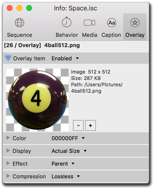
Some technical information about the overlay asset.
Selecting a different Overlay file
You can easily change just the overlay image file, leaving the rest of the settings intact:
To replace an overlay file:
- Select the item(s) to edit in the Sequence editor.
- In the Info palette's Overlay tab, open the Media Item subsection by clicking the small triangle (if needed).
- Click the '+' button to replace the overlay file for the selected item(s).
- From the File Browser, select an overlay file to replace the previous one(s).
This selected file will both replace the overlay and reset some defaults (such as compression and masking) for any selected Sequence Items. Make sure to double-check all settings.
Removing an Overlay file
It is possible to delete just the Overlay file, leaving Media and Captions untouched.
To remove the overlay file:
- Select the item(s) to edit in the Sequence editor.
- In the Info palette's Overlay tab, open the Media Item subsection.
- Choose the '-' button to remove the overlay file.
This action will remove the overlay file only from the selected Sequence Items. The file(s) on disk will not be affected.
Masking with Colors and Transparencies
Images can be framed or punched out and placed on a background color, have a color tint added, can filter out a specific RGB color, or use the alpha channel masks that some file types (PNG, TIFF, GIF) provide.
Different color settings.
Setting Transparent colors
iScreensaver will use the Transparency setting's Color as a masking filter to punch out as much of that value from the image as possible.
To mask a color from an image:
- Select the item(s) to edit in the Sequence editor.
- In the Info palette's Overlay tab, open the Color subsection.
- From the Transparency pop-up menu, choose Color.
- Click on the Mask color square to open the Color palette.
- =On the Color palette, select the eyedropper cursor and use it on the image in the Media Item frame.
- Enter the RGB values (0-255, 0-255, 0-255) of the color you wish to use as a mask.
- Enter the Hue Saturation Lightness values (0-359, 0-100, 0-100) of the color you wish to use as a mask.
- Use the Tolerance slider to affect more colors similiar to the selected color.
- Your selected color should 'drop-out' of the image, showing the Background color. Reselect a color if not correct.
Tips:
- Color masking works best on a solid flat color, such as black or white.
- Using JPEG re-compression on an RGB Color Masked images will almost never work properly. The reason is that JPEG compression subtly alters the final RGB values, so they no longer match the target color. For this reason, when using color masks, don't re-compress the images using JPEG compression. Use No compression or PNG Lossless instead.
An alpha mask is an layer in an image file that defines the transparency percent when compositing the image with other images. Formats that support such are PNG-24, PICT, GIF, Targa, and are usually created and saved from Adobe Photoshop or the open source GIMP image manipulation software. Most (but not all) images with alpha channels will be automatically detected and mask settings will be auto-set, so you generally won't need to use the following instructions:
To mask a color from an image's alpha channel:
- Select the item(s) to edit in the Sequence editor.
- In the Info palette's Media tab, open the Color subsection.
- From the Transparency pop-up menu, choose Mask.
- If the file has an alpha mask, then that region should 'drop-out' of the image, showing the Background color.
Any changes you make here do not affect the original media file on disk, so feel free to experiment!
Adjusting Foreground Tint
The overlay item's color spectrum can be tinted by setting the Foreground color with the Color palette. This only works on Images. Note that in addition to changing the RGB color values, you can also change the Alpha percent. Alpha values less than 255 will cause the image to blend in with the media and background.
Adjusting Background Color
The overlay item's background color can be changed using the Foreground color with the Color palette. For Image assets, you can also change the Alpha value of the background color. Combined with the various Transparency settings, this can give you various interesting effects: for example, using a PNG with mask, you could make the background opaque and the foreground transparent, or vice versa.
Tips:
- It's possible to end up with a color setting that makes no sense. To return to the default values, set Transparency to "mask", set Tint to pure white and full opacity (RGBA 255,255,255,255), and set BG Color to pure black and zero opacity (RGBA 0,0,0,0).
Adjusting Background colors
The overlay's background can be changed -- this will only be seen for images with alpha channels or when using color masking.
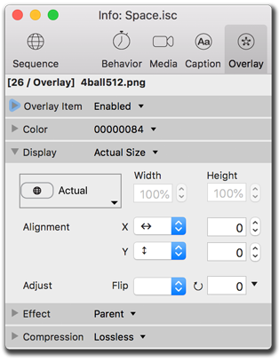
Adjusting Overlay Size and Location
Overlay Images can be placed anywhere on the screen in two dimensions, and can be sized using several size modes. This is a tricky part of good design, because many computers have different screen sizes: pixel width, pixel height, and aspect ratios. See Designing & Preparing for more information and tips.
Note that overlay images, when large size, can cause slower performance and use extra CPU resources. For best results, use small overlay images set to 'Actual size' display mode. Make sure to test on slower computers.
Different settings for screen sizing and location, flipping, and rotation.
Using the Stretch mode
For overlays, usually it is recommended to leave them at actual size.
Actual Size
Uses the exact picture pixel arrangement, no matter its relation to the monitor resolution. One pixel will be shown as one pixel.
Letterbox
Proportionally scales the overlay to keep it contained fully on-screen.
Crop
Proportionally scales the overlay to fill the screen, whether or not it all stays onscreen.
Full Screen
Non-proportionally stretches the overlay to fit the screen completely, regardless of asset dimensions.
Custom X and Y
Set the width and height of the caption to display on-screen as desired, in absolute pixels or percentage of the screen size. Leave one field blank to proportionally frame the overlay.
Using the Location controls
The Overlay Item will be positioned on the screen according to the settings of the Location controls. Using X (width) and Y (height), the asset can be positioned to a particular spot, or to a proportional location. It is worth testing many screen sizes with the Preview stage when using these settings.
X / Width
Defaults to the center of the end user's monitor. Can be aligned to either the left or right sides of the screen, with optional pixel or % offsets.
Y / Height
Defaults to the center of the end user's monitor. Can be aligned to either the top or bottom sides of the screen, with optional pixel or % offsets.
Values
Offset numbers can be expressed in positive or negative pixel amounts, or by percentage of the end user's monitor setup. Use the '%' symbol after the number to differentiate percentages from pixels. Negative percentages are possible, though likely to display overlays off-screen.
The width set to 5% (percent) of the screen size, height set to 5 pixels.
Adjusting Flip and Rotation
Image files can be flipped or rotated. This does not affect the original file on disk.
Flip
Image Assets can be flipped horizontally, vertically, or both directions at once.
Rotate
Image Assets can be rotated to any angle. There are some presets for rotating clockwise or counter-clockwise 90-degrees, as well as a 180-degree flip.
Tips:
- The Stretch Mode and Alignment settings generally follow HTML5 rules: a raw number (such as 123) is interpreted as a pixel value, whereas a number with a % sign (such as 45%) is interpreted as a percent of the screen width.
- Screen width is determined at the time of playback on the user's computer. So 50% of the author's screen width will probably not be the same as 50% of the end-users's screen width.
- Note that overlay images, when large, can cause slower performance and use extra CPU resources. For best results, use small overlay images in Actual size mode. Test on slower computers.
Setting the Visual Effect Transition
Each overlay has a transition effect available for how it is displayed. The default is a one second dissolve.
Overlay effect settings.
Types of Transitions
Most all effects are available, as Overlays can have a variety of XYZ motion.
Default
Matches the timing of the Media Item's effect transition.
Cut
An immediate switch from the previous asset.
Dissolve
A slow fade between the previous overlay and the new overlay.
Custom...
Use various XYZ location and motion velocities to manipulate the overlay in any direction.
Setting Durations
Every effect, except cut, has a duration length setting.
Random Motion
Some effects have random motion options, turning these off will result in constant stability in overlay objects.
Previewing Transitions
Use the A / B thumbnail previewer by opening the Effect subsection. Replay the preview with the Recycle button.
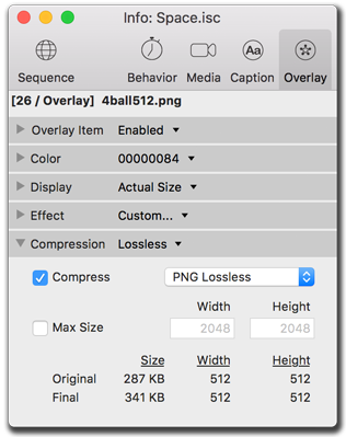
Working with Compression Presets
Image files (JPG, PNG, etc.) can be resized and/or re-compressed when used in iScreensaver. This has several advantages: You can import high-resolution images directly from your camera without re-sizing first. Images can be easily resized using presets in case you wish to build more than one version (for example, a "high resolution" and "low resolution" version. Please Read about Image Size limitations and Best Practices.
Overlay compression settings.
Presets
The compression/size presets menu has a few settings that will often work for most situations. Use the Custom setting for manual control of the parameters.
Compress
Choose a compression level.
- PNG : a "Perfect" or "Lossless" compressor that also preserves the alpha-channel (transparency) and does not introduce any noise into the image. If it's perfect, why not use it always? There's a catch: PNG does not compress very highly, so the final Image byte size is often very large.
- JPEG: a "lossy" compressor, JPEG does not support alpha channels (transparency), but is a much more efficient compressor than PNG, often compressing images 2, 5, 10, or even 50 times smaller than PNG. JPEG 8 is the best quality (but largest file size) and JPEG 0 is the worst quality (but smaller file size).
Maximum Size
It's very important to limit images to a size that is appropriate for the end user's monitor size and computer speed. Using this setting, images that are larger than the width or height provided will be proportionally resized. Images smaller than the width & height will not be resized. Please Read about Image Size limitations and Best Practices.
Original & Final Image Size
When using resizing/compression, if a single item is selected, the image size (pixels and bytes) will be shown. Note: this may take a few seconds to update with large images.
Tips:
- Overlay images should be small -- large overlay images can cause slow playback performance.
- Please Read about Image Size limitations and Best Practices.
- Compression and resize settings never affect your original files on disk. Feel free to experiment.
- Images usually look better when keeping a high maximum size while reducing the compression factor. An image saved at 1600x1200 Low compression looks better than if saved at 800x600 High compression, even on smaller monitor systems.
- When using the "Actual Size" Display / Stretch mode settings, the actual size used will be the size after resizing and compression.
- There is a maximum image size of 4096 pixels in width and height. Any images larger than this will be automatically resized down. Warnings that this is happening will be seen in the Build logs.
Making changes across Multiple Items
A screensaver sequence may have tens or hundreds, or even thousands of items. Therefore it's handy to know how to make changes can be made more than one item at once: Just select one or more item(s), and then edit the settings in the Info palette. If a setting change is inappropriate for a selected asset in a varied group, the change will not affect that asset and will be ignored. If you make a mistake, use the Edit/Undo command.
Selecting a range of Items
This works similarly to selecting files in the Finder (Mac) or Explorer (Windows) and can be done with keyboard or mouse: In a sequence, choose your first selection, then shift-click on your last selection to choose everything in between.
Selecting non-contiguous Items
This works similarly to selecting files in the Finder (Mac) or Explorer (Windows) and can be done with keyboard or mouse: On Macintosh - command-click each selection to choose a non-contiguous selection. On Windows, control-click each selection to choose a non-contiguous selection.
Sorting Items with List View
In List view you can sort by any visible column. This can help you find items with a particuler settings or property. For example, to quickly select only Image files, just sort by the "Kind" column.
To sort items in a sequence:
- In the Video or Audio sequence tab, click the List View button.
- Choose a column to sort the list.
Click a second time to reverse the order of that column. - Control-click the column titles to open the Select Columns dialog to view more columns. Re-sort this list to re-order the columns.
Tips:
- A maximum of 62 columns can be viewed at one time. If the limit is reached, deselect columns that are not currently needed. Toggling on 'Select All' will reach this limit.
- The list order is temporary and will not affect the actual playback sequence order. Return to correct sequence order by choosing the '#' column.
Pasting attributes
What about applying some properties from one item to a group of items? Simple, just use the 'Paste Attributes.' This means pasting just the Background Color to all the other assets. Or just the X Rotation of a Custom Effect. Or even both at once. Just about any setting can be pasted onto any item in the sequence, or even across projects.
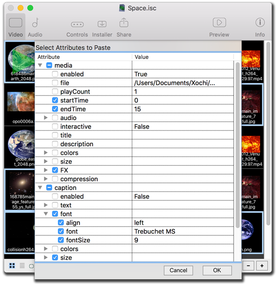
Pasting attributes is an easy way to transfer a single setting, even across different projects.
To paste attributes:
- In the Video or Audio tabs, select a single item.
- Copy the item's settings by doing one of the following:
- On Macintosh, type Command-C to copy.
- On Windows, type Control-C to copy.
- Choose 'Copy' from the Edit menu.
- Control-click the item for the 'Edit > Copy' pop-up contextual menu. - In the sequence, select one more more item(s) to modify.
- Open the Paste Attributes window by doing one of the following:
- Choose 'Paste Attributes...' from the Edit menu.
- Control-click for the 'Edit > Paste Attributes...' pop-up contextual menu. - On the Paste Attributes window, select the checkboxes for the settings desired, and click 'OK.'
Tips:
- Remember this is a one-to-many procedure. You can only paste attributes from a single item. You can paste the attributes onto one or more destination items.
- You can use the keyboard (arrows keys + spacebar) to select and toggle which attributes to paste.
- You can't paste across item types. For example, you can't paste a Media item's background color onto an Overlay, or vice versa.
Hey! What's Up With My Undo?
The Undo menu shows recent edits. Check under the Edit menu to view your history of the last few undoable moves. Note that it is possible to undo in time before your most recent Save, so use this feature with caution!
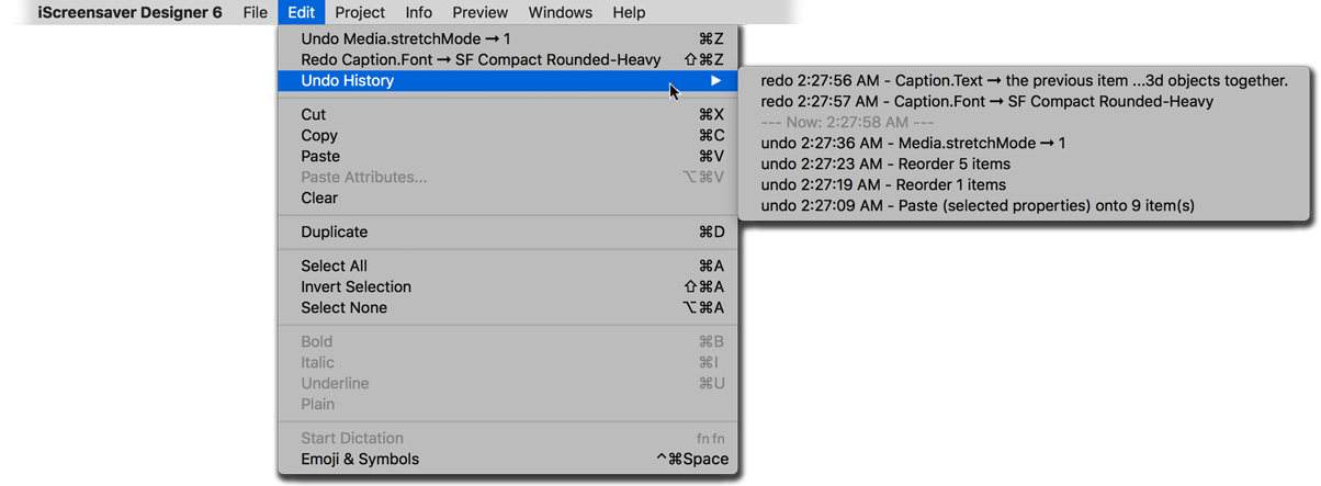
The History menu even includes a timestamp for convenience.
Reverting changes
Choosing 'Revert To Saved...' from the File menu will undo all changes since you opened or last saved the file.
Utilizing Time Machine
If working with Macintosh systems with Time Machine, remember that it should be primarily considered emergency backup, and that you still would want to periodically gather assets and projects for further archiving.
Saving periodically
It is good to 'Save As...' occasionally to keep an archived version of the project. The newly saved project will then be active, so either re-open the original, or instead, within the new saved project name increase a version number and continue working.